Wednesday, 25 June 2014

PRINCIPLES OF DESIGN ( WEEK 11 )

22th May 2014
Chuah Tien Ling


0315670
Principles of Design

( Activity : Colour**Trial )

After we have decided what game we are going to play with , we have come to trial .. xD

I was one of the photographer and I was in the canvas group .


we had tried to shoot the balloon yet was because of we couldn't get the water balloon that we want and we use another type of it. the trial was fail. 


PRINCIPLES OF DESIGN ( WEEK 10 )

15st May 2014
Chuah Tien Ling

0315670
Principles of Design

Activity : Colour**Lecture )

For today's class. We had a discussion about what we game that we have decided and need to do for the next class. Miss Lisa told that colour could effect us a lot including mood. She asked us to do some research on colour and write on our blog. 

We've been dealing a bit with Color Theory on our site, but now we're going to dive into something equally important - Color Psychology.

Colors affect our moods. Depending on where in the world we live, we bring with us perceptions of color based on our culture. Even within a single country alone, the "meaning" of colors have changed over time. Today, though, psychiatrists are able to pinpoint a few universal truths about color and its effect on our "psyche" (conventional psychology completely dismisses the idea that color can affect our moods).
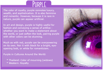
Why is this so vitally important? Simple - if you're creating a website that should bring ideas of nature, and all things natural you're going to stay away from purple. Because purple appears so little in the natural world, it is often seen as "artificial". However, if your site is about furnishings and opulent decoration, purple accents would be perfect - imparting ideas of royalty, luxury, wealth, and sophistication.

Colors in Advertising
I've already mentioned the idea that colors can - and should - affect website layouts. There are actually many simple rules in choosing the right color combinations, and most of them relate to how the color affects the conscious mind of individuals.
For instance, if you are selling products on your website, you should understand the specific role of color psychology in online marketing. Red stimulates us into action, represents aggressiveness, excitement, and paired up with gray, it represents impulsiveness. Blue represents sensitivity in feeling, and loyalty. In an online business, shades of red, blue, and brown have been found to be the "safest". While white is always seen as "professional" when viewed on a business site, it is color that makes the first impression.

History of Color Psychology
Johann Wolfgang Goethe was one of the first people to connect color and psychology, with his book "Theory of Colours". In 1947, Max Luscher took Goethe's theories one step further and actually created a color test for the use of psychiatrists, psychologists, physicians, and others involved with the "conscious and unconscious characteristics and motivations of others". Despite the ease with which Luscher's test can be administered, it is a very "deep" psychological test that can reveal a multitude of things about one's personality.
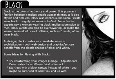
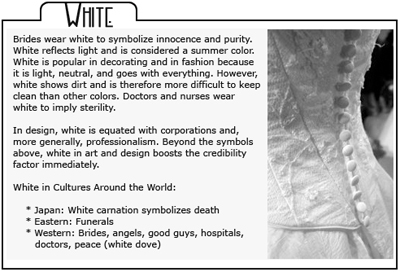
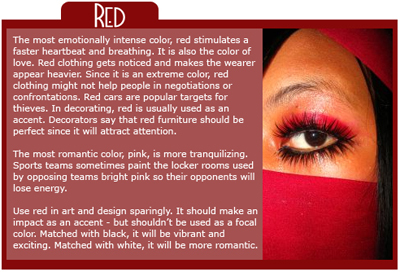
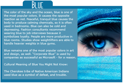
Color Meanings
I had a lot of fun with this. You can actually print the following cards and save them for reference - I promise, not only will you "look" more professional with a set of these (might I suggest laminating them?) but you will be able to quickly and easily perform more professional work. Hey, we just love you guys, you think we would make something any less cool than this? :)

Color Psychology: The Cards

image 1
image 2
image 3
image 4
image 5
image 6
Color Psychology Quick Reference Cards


this is the game that my teammate and I have done after discussion hour. 

PRINCIPLES OF DESIGN ( WEEK 8 )

1st May 2014
Chuah Tien Ling

0315670
Principles of Design
( Assignment 3: Paper cutting**Presentation )

For this assignment I was totally have no  claminess at all .. I want everything fast , done faster . there I want fail for the first outcome. 


Symmetry
- I was not completed with this  


Asymmetry 
-Completed yet messy 

I have asked for redo this assignment 3 and have been approved by Miss Lisa. 

Second outcome: 

Theme : Human with bird


I want to apologies that I could know how come I uploaded the picture and it rotate itself . I already rotated it properly yet after uploaded the photo become like above.

Feedback from Lecture :

- very good and nice
- I have to be clam for every assignment so then I wont spoil it. 

PRINCIPLES OF DESIGN ( WEEK 6 )

17th April 2014
Chuah Tien Ling

0315670
Principles of Design
( Assignment 2: Paper cutting**Lecture )

Today, Miss Lisa explain about paper cut out. She showed us some of the paper cut out of our senior work after lecture. After that, she also asked to select our theme by ourselves and do some sketch on it and present to her.

Theme that I selected:

1) wedding dress
2) glass

3) eyes 

while .. on that day , i do not do research on paper cut out therefore i drew the real life things and was rejected by Lecture. 

Second , I was chose dragon and I present my sketch. yes ! was accepted by Miss Lisa. 


PRINCIPLES OF DESIGN ( WEEK 6 )

17th April 2014
Chuah Tien Ling

0315670
Principles of Design
( Assignment 2: Composition**Presentation )

Basically , I have missed the presentation due to I have sick on the presentation day which is week 5. I submitted my MC on this week and present my assignment 2 to Miss Lisa.. 


I do actually want to admit that I didn't done a good job for that. I was too much focus on the story line and forgot about that composition ..

Feedback form Miss Lisa..

- I was too focus on story yet forgot about composition. 

- good with using the colour and black and white tone for separate the happy and sad part. 

Wednesday, 4 June 2014

PRINCIPLES OF DESIGN ( WEEK 4 )

6th March 2014
Chuah Tien Ling

0315670
Principles of Design
( Assignment 2: Composition**Lecture )

Ms. Maslisa gave us lecture about composition. After that, she showed us a slide about the rules of thirds and the principles underpinning composition. She showed us as many as examples that she had so that we could understand clearly about the usage of both the rules of thirds and the principles underpinning composition. It is absolutely important that as a designer he or she must fully understand the concept of the said rules and principles.Based on how the placement and pattern of lines could actually giving the audience feelings towards the observer, it is one of the new way for me ale to transfer my idea to others through a simple picture or art work.

After the 30 minutes short lecture, Ms Lisa then proceeded to our 2nd assignment, we have been told that to take about 50 pictures. Pictures have to based on both, which is in the campus itself and outdoor with a clear subject matter and compile it into a video. This assignment is to mainly to test us on our ability where by applying the rules of thirds and the principles underpinning composition when taking photos. Ms Lisa also showed us a few videos made by our seniors.

First, she ordered us to cut out a border using a black mounting board. After done, we were then supposed to go around campus to take photos of at least three different subject matter to be proposed to Ms Lisa. We all went around campus taking photographs of random objects while holding our borders.

The four subjects matter that I chose were:

1. Camera
2. Shoes
3. Street
4. Robot Boxes

It was then my turn to propose my subjects of matter to Ms Lisa. I was extremely nervous as I was afraid Ms Lisa will reject my chosen subjects. Yet luckily, she accept and chose shoes for my subject of matter.

But when I went home, I redo and send a new one for Miss Lisa which is Robot Boxes and she straight away accept it. 

Saturday, 15 March 2014

PRINCIPLES OF DESIGN ( WEEK 3 )

27th February 2014
Chuah Tien Ling

0315670
Principles of Design
(Art Movement- Research)

Lecture:

Last week, before class dismissed, Miss Lisa gave us a short briefing about art movement and she asked us to back home to do more research art movement which we like and best suits to ourselves. We have to bring the result on next lesson, which is today's lecture. 

I have chose 3 at first. which is Futurism, Op-Art, and Western Cubism. My group have a meeting with Miss Lisa at 11.30. I reached there earlier and I was the first one to discuss with her. After the discussion, I do really imagined myself was like a Robotcop or any other things which related to mechanic as well. I rejected Cubism at first, which I like but not much at the rest 2. Miss Lisa gave me a suggestion which not to pick Op-Art because it is not much can I design. Last I have decided with Miss Lisa and chose Futurism.

So, to my research, Futurism was an international art movement founded in Italy in 1909. It was (and is) a refreshing contrast to the weepy sentimentalism of Romanticism. The Futurists loved speed, noise, machines, pollution, and cities; they embraced the exciting new world that was then upon them rather than hypocritically enjoying the modern world’s comforts while loudly denouncing the forces that made them possible. Fearing and attacking technology has become almost second nature to many people today; the Futurist manifestos show us an alternative philosophy. It is something in future. It may be real and may not as well. It's something seem not organized yet it is in a really perfect organized. 


This are the art movement (SKETCH) that I gave chose.
And what I have understood. 

The one week before due date, I asked Miss Lisa can I do something in 3D. The reason I think so is not like I wanted to show off or whatever. I just carry what Miss Lisa told me. #gobeyondyourlimit 
I don't want to be too flat. I want to try something new. And, this has been accepted by Miss Lisa. 

I have to admit that I'm just too lazy, I did not do anything else going to trip. After I came back from trip, I was play around for 2/3 days. I started to do this assignment just right 2 days before due date.